The Cimpress Style Guide and UI Library
The building blocks for an entire platform.
Background:
As part of the transition to an open platform, software teams at Cimpress became reliant on micro-services, more decentralized, and generally began to work independently of each other. While this helped speed up development of individual platform components, it made a mess of the end-user experience.

My Role:
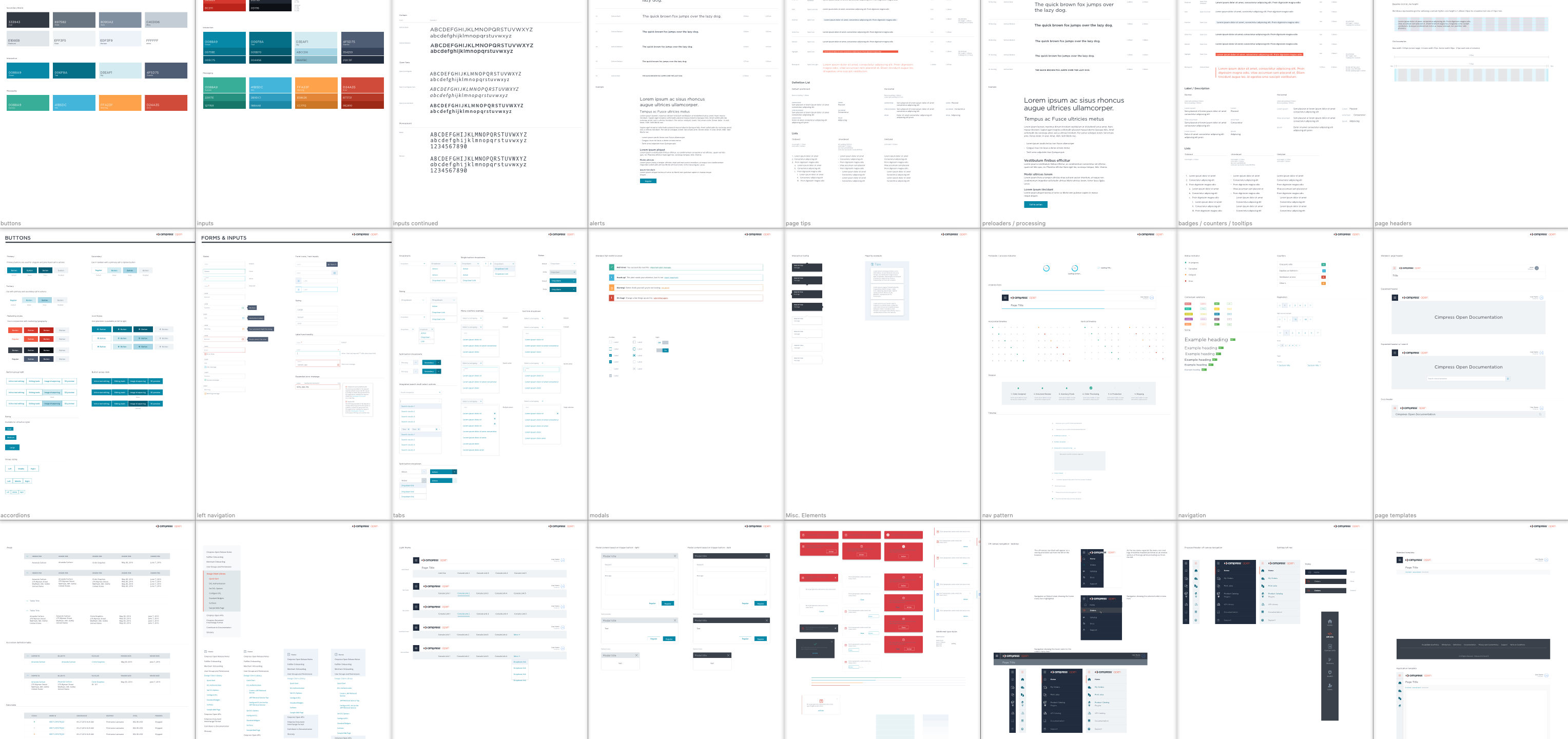
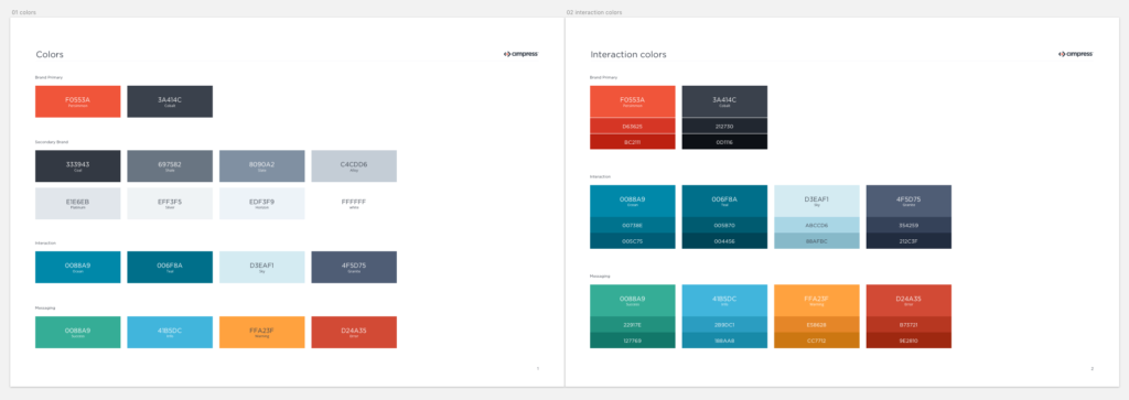
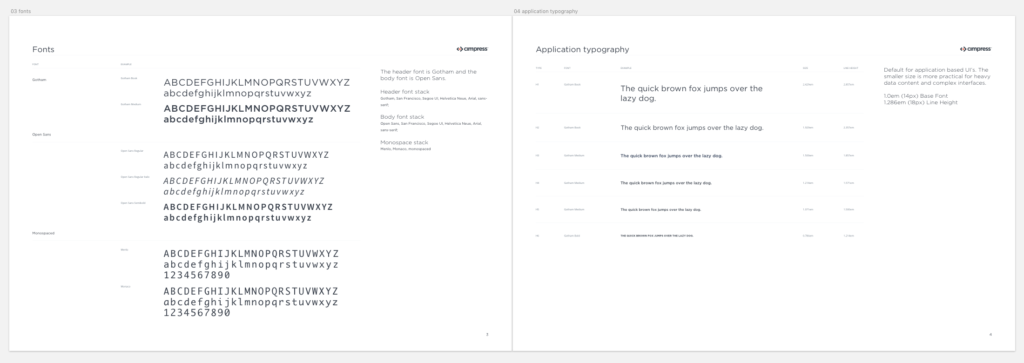
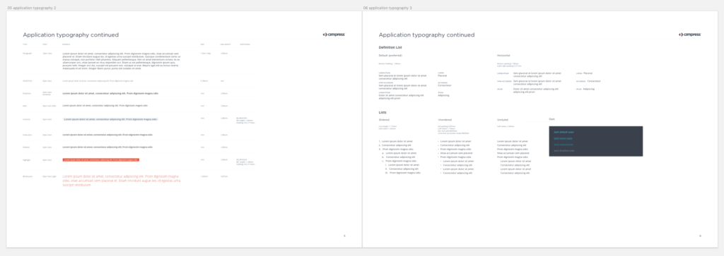
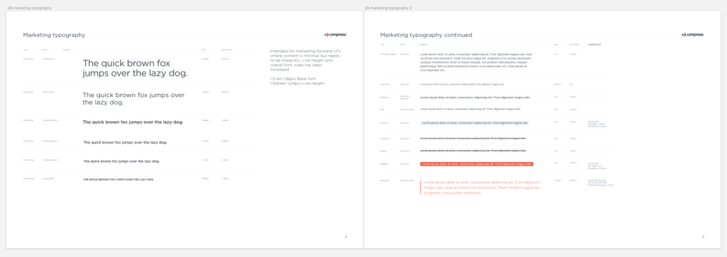
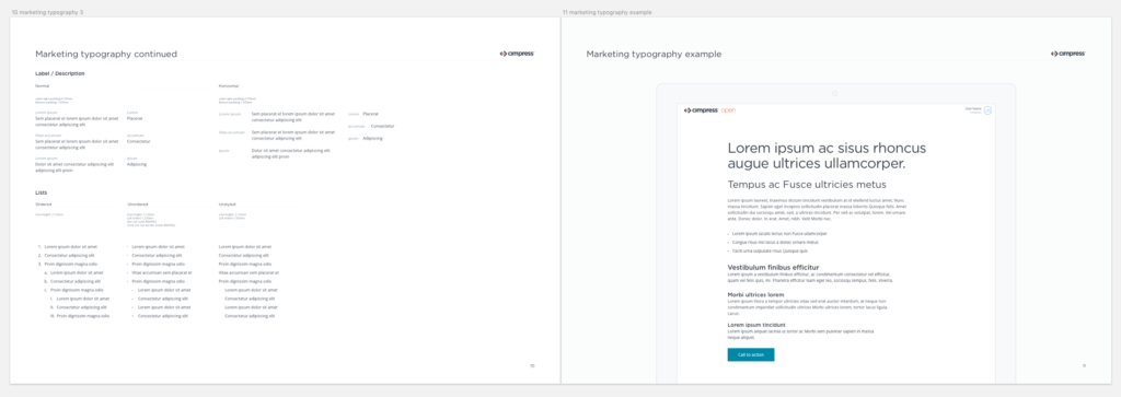
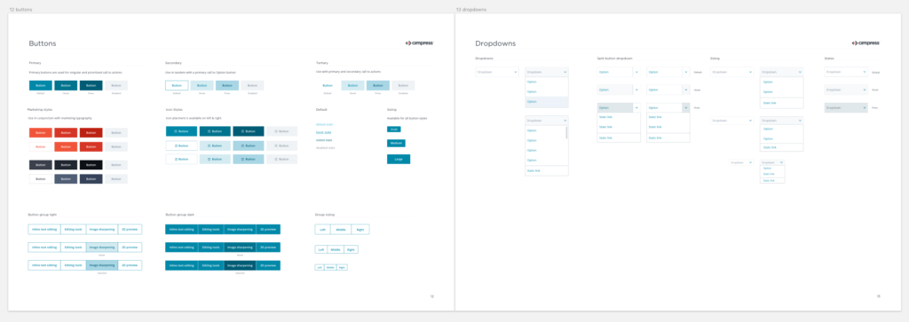
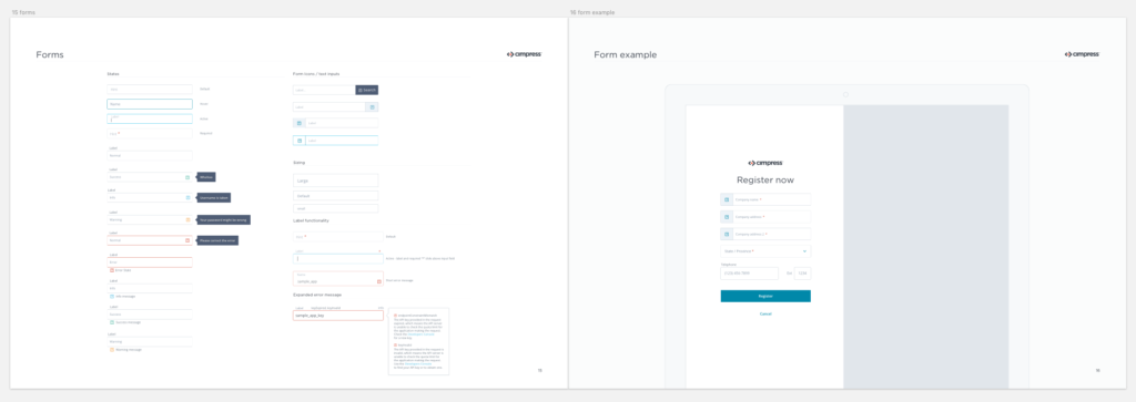
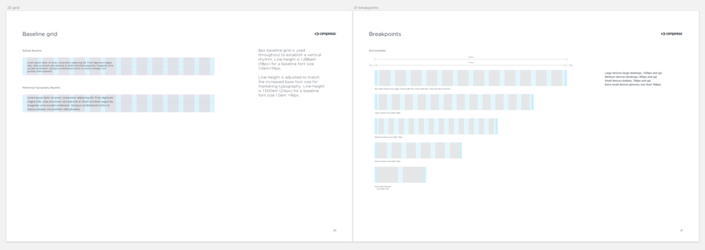
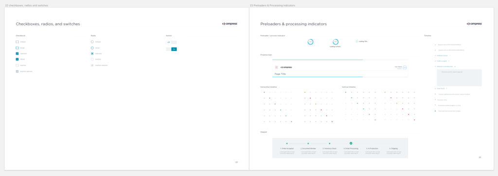
It soon became clear that for us to alleviate at least the visual issues we needed to implement some level of UI standards. After working with various engineering Team Leads and Product Owners to assess their UI needs, I developed a plan for better cross-platform integration starting with a simple styleguide to be implemented through a variety of front-end frameworks. Rather than forcing all teams to implement this work in the same way, my designers worked with individual teams to produce reusable frameworks that other developers then had the option to use. The idea being that any future projects could benefit from the library of components that best fit their needs, so long as they all present the same cohesive visual identity to our end-users.
After 1-2 months of creative sprints the team had completed the initial version of the styleguide and began to work with different product teams to integrate it into their work. A marriage of Cimpress’ straightforward branding with a simple clean UI, it became the default look for our new platform.

