Acquia Style Guide
Getting everyone and their products onto the same page.
Background:
In 2018 Acquia had 6-7 different products that the company marketed to 3 different groups (Developers, Marketers, Content Authors). Each of these products had been designed by different groups over the years, and there was no common visual language between them. Some like Lift even had multiple mis-matched UIs in a single product!
The UX team was under pressure to deliver an updated style guide to refresh the look and feel of our products and help guide new product development. Unfortunately, that pressure came from different groups across the company in the form of competing goals and conflicting feedback… And we had no shortage of requests that pretty much amounted to “make it look pretty".

Working through “Product Toolbar Actions" with the other designers.
My Role:
It was hard for the group to focus their design efforts with all these different voices and competing goals. As a UX Manager responsible for the design of all of Acquia's marketing and content authoring products I had a sizable stake in an effort like this, but little resources or time to dedicate to it. After watching the initiative flouder for a bit I decided to get more involved and get this effort back on track.
The project was tracked as a single deliverable with a few sub-tasks but no real intermediary deadlines to show progress. I immediately broke up the work into component-based chunks with staggered dates and deliverables for each chunk. I wanted to get the team out of larger generic conversations about UIs that kept going nowhere. Instead, I held smaller workshops with the designers that progressively built up from small elements like typography and color to larger shared components like application toolbars, headers, footers etc.. The purpose of these workshops was to have the designers collaboratively work through all the details and use cases of our UIs. Then at the end of each session divvy up the necessary design tasks to incorporate our work into a unified style guide. This helped build a shared understanding within UX for how each part of the style guide was used across our products. It also helped me structure and track each design task necessary and make sure the team kept up forward progress toward a cohesive redesign. The difference was night and day as the designers became more engaged in the effort and were able to see results and communicate their progress more regularly.
After about 2-3 months we had worked through a complete style guide and began working with developers to apply it to Acquia's primary UI framework, UIkit. The effort continued over 6 more months as UIkit was fully updated. Now Acquia had a clean, unified visual language across all of its products that the whole design team understood. With the added benefit to UX that there was now a framework in place we could easily update from a visual perspective to match that year's Acquia's rebranding efforts that year. In other words… now you can finally make it pretty!
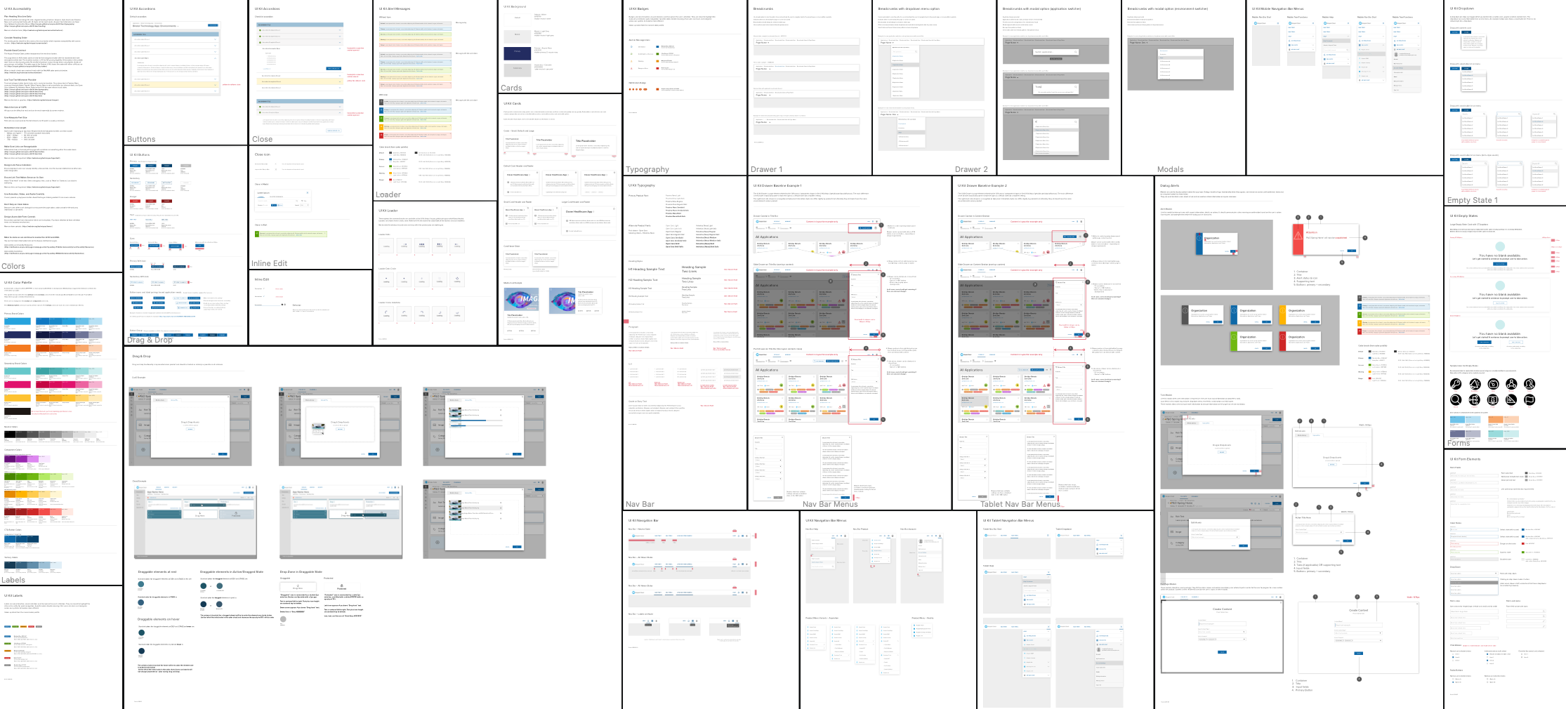
Acquia Styleguide Examples: