
Case Study
Project “Columbus”
In 2015 I helped kick off the Columbus Project; a multi-year “skunk works” style operation to transition a printing company into a mass customization leader.
In a few short years I created and staffed a new UX department, 2 product photography studios, and hired 3 copywriters. Together, we took Cimpress from 30 to over 10,000 SKUs, and our beta release generated 50 million in sales in the first year.
For the record: Not my idea for a project name. Not a fan.
Mass Customization is the developing, producing, marketing and delivering of affordable goods and services with enough variety and customization that nearly everyone finds exactly what they want.
Joseph Pine II “Mass Customization: The New Frontier in Business Competition” (Harvard Business School Press, 1993)
Background:
In UX you’re constantly challenged to solve for as many users’ unique needs as possible. While it’s one thing to do that in a digital space, “mass customization” is an attempt to tailor physical products and processes to those idiosyncrasies on a massive scale. You can find it everywhere from Tesla’s approach to selling cars, to the promotional swag at trade shows, to the design-your-own dress shirts of Indochino.
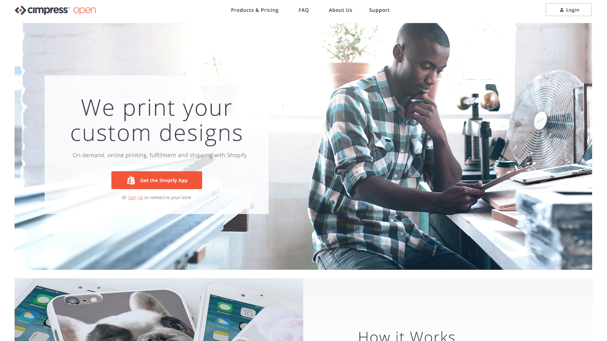
Instead of competing in one vertical slice of the market, like for instance “dress shirts” or “promotional products”, what if you could create a platform to power all of those use cases, for any business? That was the vision of Cimpress. To become the mass customization leader powering other businesses all across the globe.

Similar players in the online customization space. “Blue Ocean” top right.
Though we weren’t able to customize every product under the sun, at least not at first, the goal was to offer as wide and robust of a product catalog as possible, and to have them all 100% do-it-yourself customizable online. There were a LOT of other companies already competing in this space, but none at the scale and capability that Cimpress envisioned. If they could successfully pull off the transition from paper printing into mass customization, there was plenty of money to be made.
The Problem:
You’ve got to start with the customer experience and work backwards to the technology. You can’t start with the technology and try to figure out where you’re going to sell it.
Obligatory Steve Jobs Quote
There were plenty of challenges in this transition. Largest among them, was that the company had never dealt with so many different types of products before. Previously, all of Cimpress’ business units offered the same 30 SKUs; mostly paper products like posters and business cards. If any of them offered something else like a t-shirt… typically customers got one option and it was only available in white. In other words, it wasn’t really considered a product but instead treated like a paper substrate.
Going from 10 sizes of paper to 10,000+ products.
Now we’re talking about expanding the company’s product catalog from 30 to over 10,000 SKUs. This wasn’t just a fulfillment problem. Cimpress had no experience with how users evaluated, designed, or purchased these types of products as well. Any user concerns were left up to individual business units who developed their own tailored UX based around company-designed templates printed on paper products.
Unfortunately since those BUs kept the lights on, their leadership often had an outsized voice. This transition was no different. So to balance their internal perspectives, the Columbus Project was formed. It was essentially a small dedicated group tasked to learn as much as possible, as fast as possible, to then produce viable business applications within 18 months.
My Role:
Since pretty much all user concerns were left up to the company’s business units, Cimpress had no real UX or design presence other than myself. At the time I was working in the company’s “Innovation and Capabilities Incubation Lab”, a.k.a. CAPLAB.

I was a single designer working with a couple of developers and scientists on small projects meant to foster innovation within the company. No real money makers, but instead neat ideas to help shake things up internally. CAPLAB reported our work directly to the CEO of the company. During one such check-in we were told there was a new, super secret project and the CEO then gave us two options: either we drop everything and kick off “Columbus” now, or we could take a month to mothball whatever we were doing and but then we had to join… Of course, we chose to pivot and get started right away.
As the sole design resource for the company and this project I had my work cut out for me! Early on I provided a voice and perspective for our users and worked closely with the VP of Strategy to define high-level strategic goals, but over time my role grew.
Eventually, I was responsible not just for all UX Design, but Product Photography, Product Modeling, and Creative Direction as well. I hired and managed around 30 product photographers and merchandising associates, as well as 2 teams of Designers and Copywriters. I eventually created a whole new UX dept. and hired additional Copywriters to turn the project’s rough work into a mass-customization platform that any company, internally or externally, could use.
Process:
The project went through 5 distinct phases as we moved from concepts to reality. With each phase I put on a new hat and provide design leadership in different groups and disciplines.
Those different phases were:
1. EMPATHY
2. CALCULATE THE DELTA
3. BLUE SKY
4. BUILD
5. ENABLE
I reported directly to the SVP of Technology since there was no other design leadership in the company. While this wasn’t a typical reporting structure, it afforded me plenty of flexibility to adapt and best support the teams however I saw fit. Also, throughout the entire project everything was a total secret to the other parts of the company! So I was completely decoupled from the main business in our effort to turbo-charge this endeavor as much as possible.
Phase 1: Empathizing
Initial conversations in the project tended to drift toward technical concerns and internal capabilities. Not that these weren’t important topics, but no one was asking about potential users and their needs. At times it felt like the company had an “if we build it, they will come” mentality.
Luckily, I was able to partner with the VP of Strategy to help shape focus groups and interviews. Over the next few months, we conducted 16 different focus group sessions across the US, U.K., France, and Germany. We conducted card sorting exercises and helped guide some of the questions, steering conversations in these focus groups to learn more about people’s shopping habits in this space, how they viewed Cimpress’ current print experience, and their expectations with mass customized goods.

Observing focus group sessions.

At the same time, I was researching all I could about the e-commerce funnels, mass-customization, and familiarizing myself with the existing UX of every one of Cimpress’ business units, starting with Vistaprint. They generated most of the company’s revenue and so VP’s leadership saw no reason for us to approach mass-customization any differently than they do business cards!
I analyzed Vistaprint’s customer journey and overall UX, as well as those of our major competitors and compared them with our findings from the focus groups. When we presented this work along with the team’s recommendations to the CEO and project leadership it was agreed we should explore new approaches to meet our users’ needs.
Findings:
You can’t touch and can’t feel… You get what you pay for, and no one wants cheap crap.
Participant #3 Session 5, Coffee Shop Owner, U.K.
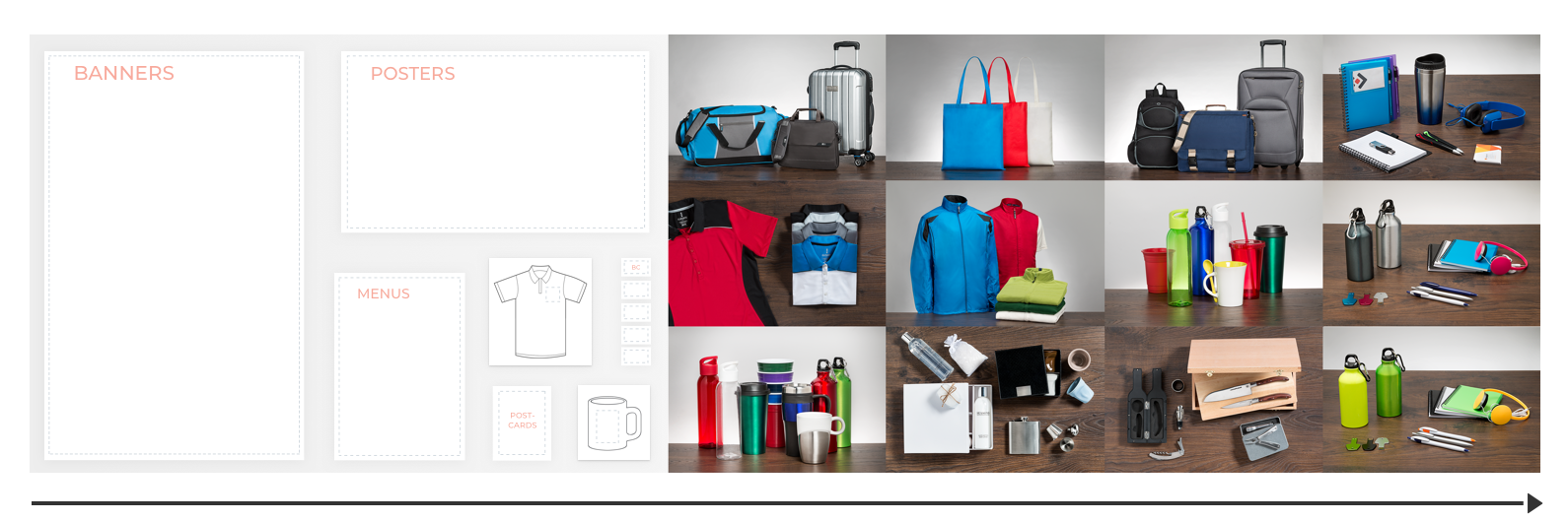
Early on, promotional items and decorated apparel were identified as products with the most interest from our participants. They weren’t looking for exotic things like custom stitched direct-to-garment apparel to drop-ship direct to consumers. They just wanted their company logo on a nice jacket or mug.
Getting that jacket or mug however, turned out to be a huge pain in the ass. Across the 60+ individuals interviewed we had some consistent feedback around the biggest issues they faced when shopping for these products.
Feedback primarily centered around these main issues:
When asked to react to Vistaprint’s current UX and product offering most said the experience was confusing and their decoration/products considered cheap. Vistaprint made you shop for designs first, product second. This was the opposite of what our participants wanted. In a sea of products, they wanted the tools to evaluate not just the item itself, but also when combined with their logo/design. The entire flow of purchasing from one of our existing BU’s website was cited by one participant as a classic example of what not to do!
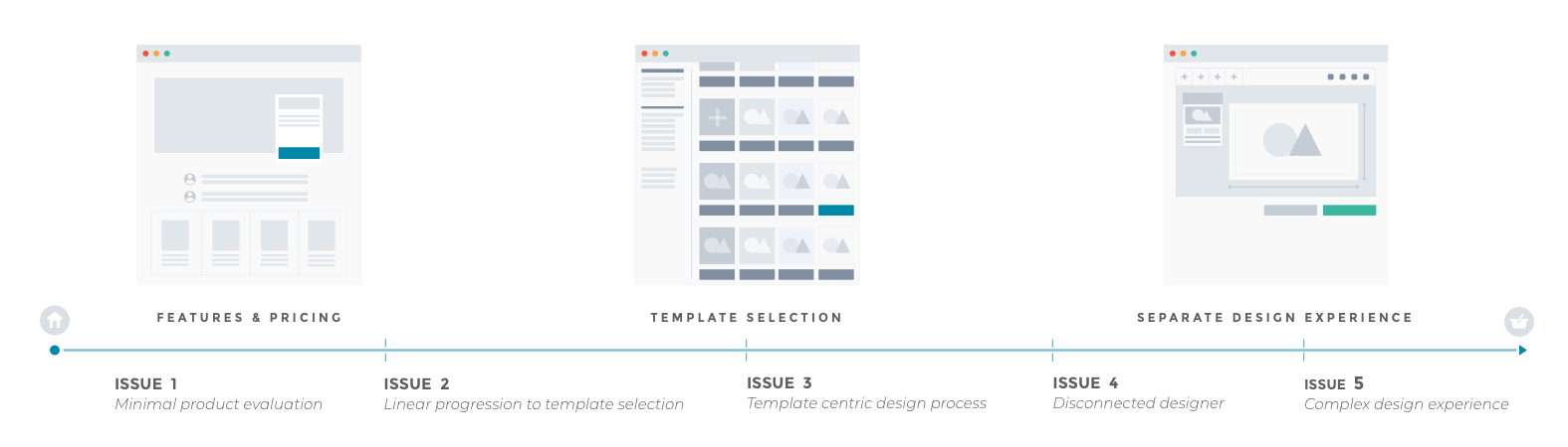
Vistaprint’s… “unique”… site flow.
Table Stakes:
Most participants did not identify with any of the current approaches to customizing products. Vistaprint for instance itself had a unique customer flow dedicated more to selling you an identity in the form of a design “template” than evaluating products. Unlike your garden variety e-commerce experience, Vistaprint’s UX had a number of quirks.
Over and over participants kept telling us how easy it was for them to shop at places like Amazon.com. “So why does this have to be any different?” Obviously people have a certain “table-stakes” level of expectations when shopping online. But what became clear was how much the act of customizing products got in the way of those expectations.
Breaking down Vistaprint’s flow:
The whole process required a bunch of clicks across multiple pages.
This was in stark contrast to the rest of the customized goods industry where research showed most customers already had established branding and logos.
At this point you're 4 screens and many clicks in. To look at another product you’d have to start over. Most users said they’d drop out and shop somewhere else.
Any change in templates, or product options requires exiting the design experience and re-navigating back.
There was also no mobile or responsive version of the designer in production despite an annual increase in tablet/mobile users.
Phase 2: Calculating the Delta
A golden rule in e-commerce is that you want the act of purchasing to be as simple, and “downhill” of a process as possible. Don’t make it hard for me to give you my money. So how could we eliminate the friction between shopping and DIY customizing? How can we ensure that the necessary step of customizing something doesn’t work against someone’s desire to buy it?
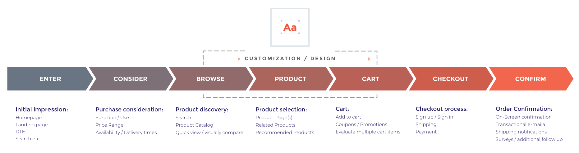
When the team presented their findings to the CEO, among other UX goals I suggested a different approach to customizing products online. I proposed we try to integrate the design experience into a standard e-commerce funnel as much as possible. Not only to reduce the friction of the whole buying process, but also to make it potentially easier to integrate our designer into any company’s shopping experience with minimal disruption.
Proposed integrated design flow.
Overall, I had 3-4 suggestions for how UX could help solve for these users’ needs. We had to address a number of complexities – the sheer volume of products offered, the various decoration technologies we wanted to offer (embroidery, full color dye-sublimation, engraving etc.) and all the various use cases customers had in mind while shopping.
So whether someone wanted their color logo on mugs to sell at their coffee shop, pens to giveaway, or even embroidered on a complete set of employee uniforms, it was my job to enable them all! It became clear that UX would bridge the gap between our old ways and this new world.
In the end, my goals for UX to address user feedback were to:
Sounds easy enough, right?
Phase 3: Blue Sky
I immediately started working with the CAPLAB team to come up with some innovative approaches to those suggestions. Taking a similar approach as the team had before, we weren’t trying to dictate specifics at this stage, but instead inspire others as the project took shape. We were constantly bringing in different leaders from fulfillment, marketing, and engineering groups to whiteboard out different solutions for their concerns. A good example of this was our product models and their affect on findability and search.


Findability & Discoverability:

The ability for customers to easily search and filter our products was widely considered a no-brainer. However, you’d be surprised how few people understood that your ability to search or filter is only as robust as the product information you record in your system. If we treated these products like printing substrates and only recorded basic specs then you wouldn’t have the data to power a user friendly search experience.
To demonstrate this, we mocked up a few demo product catalog pages, and a basic implementation of Apache Solr search. With minimal product info, the interface was useless. Essentially, you could only search by product type and titles. But with more detailed information for things like product color(s), not only do we improve search results but now we can do cool stuff like sorting results by color according to a traveling salesman solving algorithm that displays a product rainbow!

We also added basic filtering and sorting options in the demo and I got to conduct an impromptu test during a presentation by asking someone to imagine a specific product and try to find it through search. With minimal product info they had trouble narrowing down the 2,000 SKUs. Once we added in product specific info like water-proof materials, color, fit? Night and day difference.
I mocked up different types of “collection” pages/widgets. These were small examples of how we could utilize product data to merchandise collections of items to enhance users’ ability to discover new products. Ultimately, we wanted any BU to be able to merchandise products however they saw fit. These mocks were intended to show different ways they could do that, provided the product data was there.
Creating and presenting quick experience demos like this really helped show how much everyone’s work was connected and remind them how much of it affects our end users. It also helped reinforce the new mindset that these were products, not just printing substrates. After presenting this particular demo to project leadership I was asked to work closely with a Marketing Director on our product modeling and the flow for ingesting new products into our system.
Live Previews & Product Photography:

Live previews across different decoration types.
We also protoyped out new technologies for live previews of different decoration types like silk-screening, embroidery, and engraving. Typically for something like embroidery, a technician manually converts your logo into a stitch pattern and then sends you a physical sample to approve. If your logo was too thin or didn’t convert the way you wanted, the process had to start all over.
I worked with a developer and a scientist who specialized in computer vison to create new tools and technologies that enabled real time previews of your designs composited right onto the product in your web-browser. This “scene rendering” approach could handle any kind of product in real time, and even had features like variable lighting sources so the preview matched the lighting of the product!

UV test for logo compositing in product photography.
In order to composite those previews automatically across any item, I setup a photo lab to prototype product photography workflows and documented the specific shots and processes to create consistent design backgrounds. This was especially important for things like pens and mugs where we developed special tooling to deal with their curved decoration areas.

If we relied on whatever imagery our suppliers provided, the varying sources and quality of that imagery made it difficult to reliably create high quality previews. Instead we needed to control a few specific shots for that design experience. I handled the photography aspect and worked with an engineer to identify the specific shots and automate the process as much as possible.
We presented a demo of this product photography with automatically generated previews across multiple products. Immediately I was asked to scale up this whole process to cover all the 1000’s of new products in the Columbus Project. I was able to hire 3 product photographers in our Lexington office to prototype the workflows for all those products which were later implemented in 2 other photo labs by 30+ photographers I staffed and managed in Tunis.
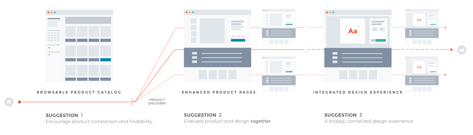
Integrated Design Experience:

Early stage sketch of an “integrated" designer UX.
Making a simple design experience isn’t a simple task. It would require lots of user testing, sketching, multiple prototypes and tons of development time to build. Before we could commit to that level of resources I made a series of quick animations to show how an embedded design experience could look and feel.

These rough visualizations were in no way realistic, and were often done quickly just to help with presenting the team’s work and inspire the company’s senior leadership. They were very well received and, when combined with the photography and product findability demos, really helped to bring all the team’s work together.
As a result, I was able to advocate for more resources, and not just for the design experience. We were asked to create a full e-commerce site to showcase all these technologies. The site wouldn’t just be a demo either! The CEO asked that we create a totally new, stand-alone business where people could customize and purchase these products for real. It was a very significant investment in the team’s work and the project very quickly shifted gears.
Phase 4: Build A New Business
We were asked to bring all this work to market, via a single commercially viable e-commerce experience in about 18 months. Technically a little less, as the goal was to have a functional beta in the US and Canada within a year…
I was responsible for 2-3 of these lanes.
Leaders from other business units were brought on to accelerate our go to market efforts as much as possible. We were targeting $20 Million in revenue within the first full year of business. So the project really benefited from their expertise. During an on site workshop a basic critical path was created that broke down related contributions between different groups. I was responsible for all of the “Site Experience”, almost half of “Physical Product” via photography, and a decent chunk of “Core Capabilities” with live previews and the designer UX.
I had plenty of work cut out for me, but my first task was to help build a pipeline for new products that included their photography and merchandising info.

Setting up my photo lab in the U.S.
Tunisia:
I had already set up a lab in our Lexington/Waltham offices to prototype product photography workflows. This included establishing which shots were needed for our design experience (front, decoration area, wrap-around etc.), the specifics of capturing them (lighting, angles, etc.), and requirements for post processing (color profiles, silhouetting, final export size/formats). I relied on my photography background and experience in production photo/video shoots to establish a set of requirements and equipment to quickly spin up additional labs, as well as the necessary documentation and training for new photographers to replicate the shots.

Throughout the project, this lab kept running with 3 full-time photographers as new products and new decoration technologies were introduced. I utilized equipment from a company called Ortery to control for angles and lighting as well as other cool stuff like automated 360 degree captures. So when the time came, it was easy to spin up additional labs for production in our Tunis office which was selected to handle new products.
The idea was that when Cimpress signs an agreement with a supplier to offer their products, samples of every color and size of those items are sent to the Tunis office to be photographed and all its product/merchandising information recorded into the product catalog. But first we had to decide what merchandising criteria needed to be captured and hire the teams to do all this!
I partnered with two Marketers to help define the website’s user-facing product model structure and merchandising info through a series of workshops and whiteboarding sessions. In these sessions we established the categories of information that were either unique to a product type or common across all types. I also presented our earlier rainbow filtering/merchandising demo to start the creative conversation about the different way to utilize this information to merchandise on the site.
Since photography reported to me, while Marketing was responsible for the physical product catalog, it was important that we also collaborated on the processes for how a new product would flow through our different teams. A Marketing Director and I traveled to Tunisia to address this as well as interview over 50 different candidates for photographers, copywriters, and merchandising reps.


In about 5 months we had fully staffed and trained the teams needed to start ingesting all these new products. By the end of the project between the 2 labs, 3 teams, and multiple shifts, we ended up hiring over 30 photographers, practically every decent product photographer in Tunis! Once this group was established and running at a steady-state we were continuously adding huge batches of new products every day. While our teams kept busy building up the product catalog, I was able to turn my attention to blowing out a full e-commerce experience to sell all their hard work.
I found two AMAZING lead photographers to manage 3 photo teams each, modeled after the group here in the U.S.. Altogether, from that trip we hired 6 photographers, 2 copywriters, and 2 merchandising reps. and I continued to work with my lead photographers over the next qtr. to source additional candidates.

Site & Design Experience:
At this scale, designing, testing, and building an e-commerce site from scratch is a case study in and of itself. Every aspect of the experience required not just consideration of its design but also how it would interact with various other parts of the website. Search term branching, pricing display, design portability, shipping… there was plenty of minutia to get bogged down with.

In a way it was helpful that I started this phase solo as it allowed me to work in a more agile fashion to quickly get started on a beta version of the site while establishing our Tunis operations. There were so many decisions to make, but as the sole designer on this project I didn’t want to work in a vacuum.
I began conducting weekly brainstorming and whiteboarding sessions, always with one marketer and one developer. That way the three of us could represent design, engineering, and product strategy together as we brainstormed through different components of the site. As needed we would bring in subject matter experts, but this core working relationship was perfect for working quickly through complex problems while making sure everyone’s voice was heard. Some good examples of this were reflected in how we approached concepts like pricing and “design portability”.
Non-designers designing designs:
After getting the Tunis groups on track I finally had time to work on our design experience. User’s had previously complained that the design experience at Vistaprint and other competitors was overly complex and intimidating. It’s easy say that something “will be simple”, the hard part is actually simplifying it. Our designer UX was no exception.
I had initially started on the UI first and after 2-3 rounds of testing had a design experience pretty well refined to handle multiple product types with minimal confusion for non-technical users. With the help of live previews users were extremely comfortable with the few amount of clicks it took to get their designs looking good right on the product. The only unexpected, curve ball we found during testing was a desire for design approvals.

Draft states and design document revisions.
During testing lots of users wanted to leave a note about their logo, or otherwise just get one more bit of confidence that their design looks good before commiting to spend. So we included a step before adding the product to the cart where users are shown a preview of their design on the full product, and asked to approve and leave a note if they wish. I honestly didn’t expect it (never get between a user and their cart), but the addition of that step tested really well with users and made them feel extra confident in placing the order.

However multiple users had mentioned that since they are not designers themselves they don’t want to spend a lot of time on the design experience anyways! And they certainly did NOT want to recreate their design over and over, every time they looked at a different product, which they cited as a big problem with a few of our competitors’ sites. Once you create a design on one product, wouldn’t it be nice if you could quickly copy that design over to other products to see how they look together? Early on it became clear, we would have to be crazy to not offer this capability.
It turns out the real challenge was in the underlying system for how we handled designs and their portability. All the UI work in the world would be useless if you required users to recreate a design for every product, every time you order. So one of the most complex aspects of the site the three of us tackled was in design portability, a.k.a. drafts.

Drafts ain’t easy.
After lots of heated debate with engineers we had worked out a system that easily allowed users to save their designs on the fly in a “draft” state so they could be loaded on other products. The system had it’s limitations though, for instance at the time we couldn’t automatically convert a full-color design to a single-color screenprint version. So initially certain designs wouldn’t be compatible with certain products. Over time these issues could be resolved but in the short term there was plenty of other work for the engineers, so we made compromises to ensure the system could still be implemented.
Regardless of the initial limitations, “drafts” was a powerful feature. Not only did it solve for obvious use-cases like saving your work, it also enabled other features that increased stickiness with our site. A few focus group participants had mentioned that if they had a whole library built up in their account of all their past designs, they wouldn’t want to shop anywhere else. At that point, customizing something could be done with a single click to load a draft or even automatically applied to search results!
A drafts section was also an easy location for customer service to help users touch up their designs. Imagine a customer ordered something but wasn’t satisfied with the way their design printed (let’s say some lines in my logo were too thin to print). Customer service could fix up that design, and “save” the improved version into the drafts section of the customer’s account for use in the future, thus reducing their reliance on customer service for future orders.
At a technical level, drafts were incredibly complicated, but I can’t imagine a world without them. While they only impacted the UI in a handful of ways, drafts provided immense value to our users. It’s a good example of how UX designers shouldn’t get myopically hung up on UIs, and be aware of how systems & user-flows can also solve problems.

Sketching out our pricing model.
Pricing:

One defining aspect of this site was that we would offer most products with no minimum order quantity, a.k.a. no MOQ. Typically when buying custom goods there’s a certain quantity required to make the order profitable. It could be a minimum of 10 polos or 500 pens, either way MOQ was considered a necessary evil and became pretty much standard in the industry. The company had committed to reducing production costs such that we could remove the need for any MOQ on most items. However, users told us they still expected a discount if they ordered more.
This presented a challenge to display pricing for a product since it was so closely related to the quantity you chose. At a quantity of one the item might appear pricey, so how can we entice users to order more and see that big discount? While specific price points/margins would be set by the company, the group came up with a way of calculating a “progressively tiered discount model” on the site where your discount increased as a function of quantity tiers. It’s complicated and it’s patented, but our users don’t care about that, they just want to save money.
After a few rounds of testing with Vistaprint customers, I had honed in on a design for a simple yet flexible pricing slider to estimate costs up front. Now users only got bogged down in quantity selection after they’ve designed the product, but could quickly estimate a price before getting started. Instead of complicated pricing tables, we came up with a simple way for our customers to control their level of discount.

Multi-size pricing calculator (Rough Wireframe)

Multi-size pricing calculator (Production Screenshots)
Beta and Beyond:
After a little under a year of designing and building, we released a limited beta of the site to “test the pipes” in the U.S. and Canada. Customers could shop for hundreds of products and customize them via embroidery or single-color screenprint. This limited beta helped us work out a lot of kinks in fulfillment and shipping, and during this time I met constantly with marketing to go over analytics data and heat maps to optimize around our users’ behavior. After 6 months in beta we opened up the site and massively expanded our product selection.
At this point the website needed more full-time attention so I hired a team of Art Directors and an additional UX Designer to continue blowing out my early designs, refining the designer experience, and assist Marketing with updating merchandising pages. I worked with my teams in Lexington and Tunis over the next 12 months to make this new business successful. And succeed we did. That first year we booked over 50 million in sales!
The project was a huge success and over the next year and a half the team would continue to add more products, 3 more decoration technologies and expand the business into the U.K., Europe, and India. As Columbus settled into a steady state, the company looked outward and started thinking about how to open up all this technology as a mass-customization platform for other businesses. The tech that powered our site could power all sorts of existing businesses, if we made it available to them. Once again, CAPLAB was asked to help make that happen.
Columbus E-commerce Wireframe Examples:


Phase 5: Enable the future
The core team that kicked off Columbus spent the next year transitioning off that project and onto what would become Cimpress OPEN. Effectively, Cimpress wanted to be the AWS of mass-customization and create a new market through this platform for companies of all sizes. To do this we had to transform all our work into products of their own. Image processing services needed to become open APIs, the design experience could be offered as a plugin, even our internal fulfillment services could be opened up to other merchants. Most of all, you needed a seamless, integrated experience for users who are not familiar with Cimpress or its internal operations, to help them recognize this value.
Noticing the scope and complexity of this endeavor, I again partnered with leaders in our corporate strategy group to help define this platform, sketch out/prototype its form, and generally ensure that this explosion of capability didn’t lead to an explosion of user problems.
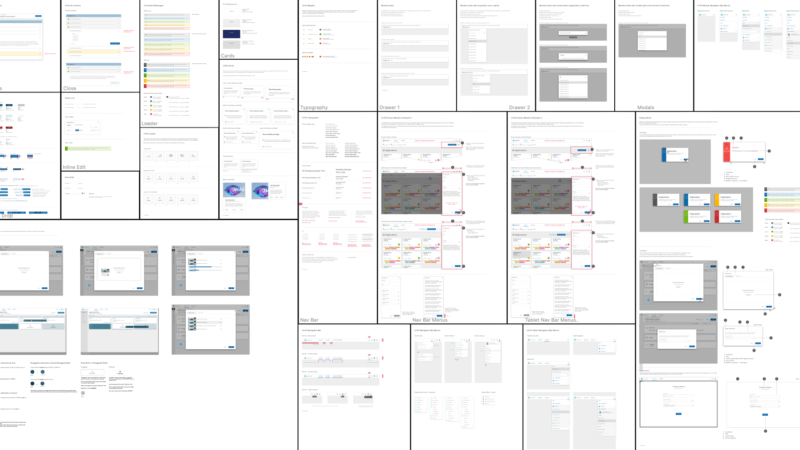
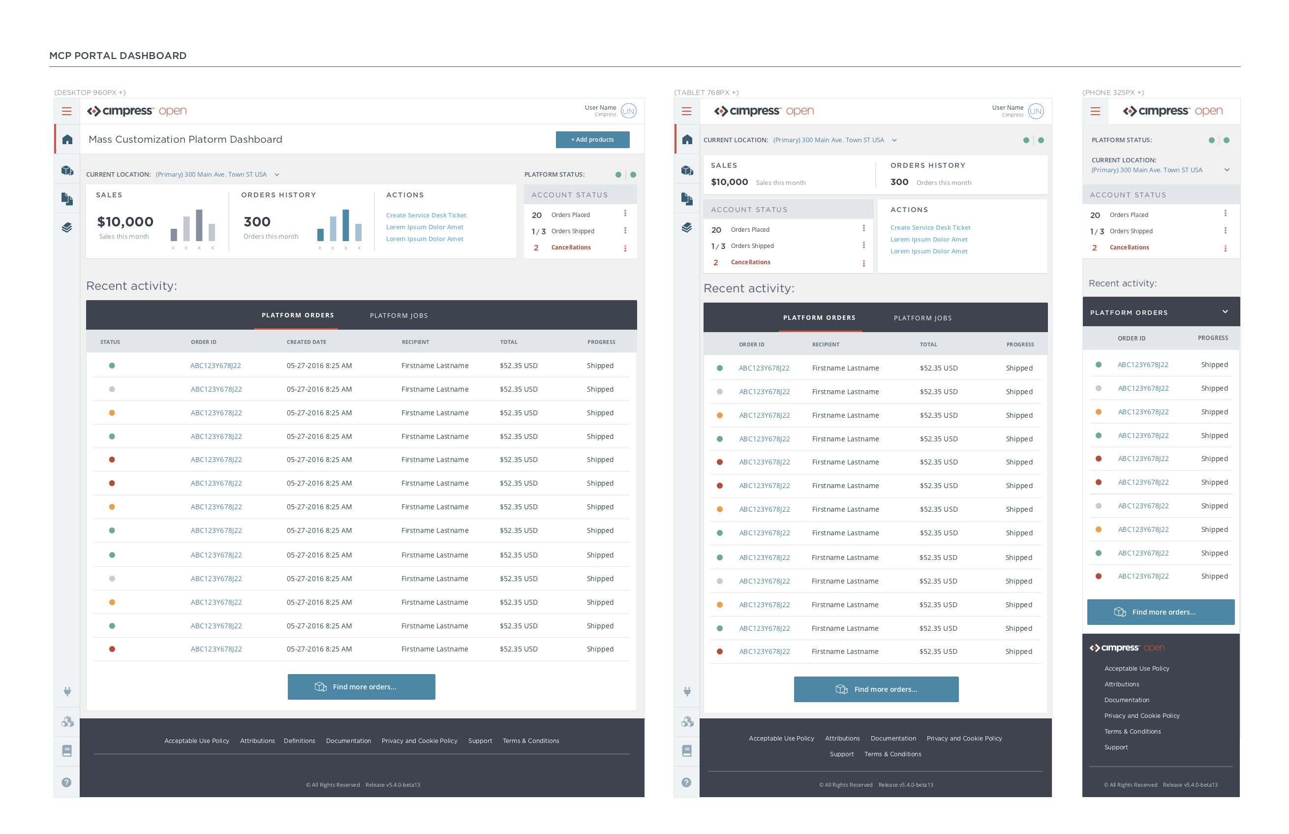
To address these concerns, I took over and unified documentation for the platform and hired 5 UX designers and 3 copywriters to work with our different software teams. The goal was to locally improve the UX and documentation of individual groups and their consoles, while sketching out a broader solution that integrates their work into a seamless platform experience for the user. We created a design system which included a style guide/component libraries that teams could easily integrate into their projects, as well as smoothing out the work flow for creating their documentation.
We also prototyped the user experience from landing at open.cimpress.io all the way to integrating various sales/design/fulfillment functions onto the platform.
Cimpress Open Platform Wireframe Examples:


Recap
The end result was a pipeline for adding thousands of SKUs to Cimpress’ product catalog, along with product photography tailored to the user experience I designed for customizing these products online, in real-time. Over the course of the project I hired 40+ photographers and designers and managed 3-4 different teams. Together we created an e-commerce business to showcase our new products, design experiences and technologies while providing an example for other companies that wished to integrate them into their own online presence. To date, that business has booked over 250 million in sales.
— All starting with just one designer, myself.