Case Study
Redesigning Acquia LIFT
Personalization is a powerful tool for marketers to increase conversion/revenue. Unfortunately for Acquia’s customers, Lift’s confusing and disorganized UX kept that power well out of reach.
I led a complete redesign of Lift from scratch to secure Acquia’s presence in the Mar-Tech space. The new version went live in 5 months with huge praise from users.
Personalization is a process that creates a relevant, individualized interaction between two parties designed to enhance the experience of the recipient. It uses insight based on the recipient’s personal data, as well as behavioral data about the actions of similar individuals, to deliver an experience to meet specific needs and preferences.
Gartner “Magic Quadrant for Personalization Engines” (July, 2018)
Background:
It may be a product recommendation on Amazon.com, or a limited-time offer on the homepage on Wendys.com, but chances are in one form or another you’ve experienced personalization. It’s a really cool way to optimize your site’s experience on-the-fly based around what you know about your visitors, their behavior on your site, and more.
Lift was created to offer Acquia’s customers web-personalization, A/B testing, ML powered content-recommendations, and powerful analytics all in one product. It was also part of a larger platform that included other products like E-mail Marketing Automation and omni-channel Content Creation. With this in mind, Acquia built up a feature set in Lift that consistently earned it a “niche player” spot in the Gartner Quadrant Reports.
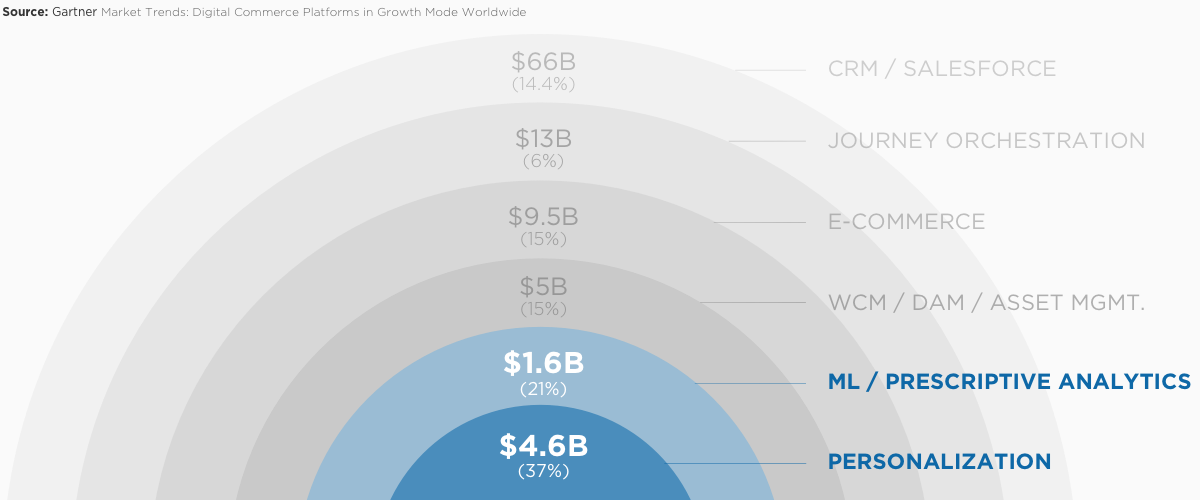
Quick idea of the TAM for Personalization and related ML/Analytics tech.
The Problem:
[Lift’s Clients] note a hard-to-understand UI that can lead to difficulty setting up rules or interpreting analytics and reporting in Acquia’s product. Gartner “Magic Quadrant for Personalization Engines” (July, 2018)
Over the years and across 3 versions of Lift, as Acquia checked off the list of required features a cohesive product yielded to more of a jumbled mix of capabilities. Lift could be a powerful tool, if you had a few extra developers, time and patience to figure it all out.
To start, Lift as a product was technically 3 different interfaces. These 3 interfaces had confusing overlaps in functionality. For instance, stuff like analytics/reporting were split between a Looker UI via iframe and a Google Chrome browser-plugin each with their own sign-ins. Each UI had a different design and appearance with no shared visual language. They each had different codebases as well, making synchronous incremental updates a nightmare.
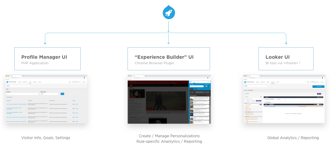
Lift V3 was a Frankenstein-like combination of 3 different UIs & Sign-Ins
The interfaces themselves, especially for Lift’s critical tasks, were often cited as confusing or unintuitive, and often required assistance from a developer. Segmenting your audience is a critical part of targeting and personalizing their experience. In Lift it was a confusing and arduous process that users straight up feared. Goals for personalizations were manged via the UI but could not really be created or edited without a developer writing additional code on your website. Issues like these prevented Lift’s core audience, that is non-technical marketers, from really getting the most out of the product.
Eventually, issues like these caused a high churn rate, reduced stickiness, and Lift’s customer base became stagnant. So the decision was made for a design-led effort to completely remake the product from scratch, addressing both architectural and user concerns all in one go. I was then recruited by Acquia to help lead the project with expected delivery of a new product in 5-6 months.
My Role:

In the beginning I was the sole design resource for the whole project. At that time, Acquia’s fledgling UX group didn’t have the capacity to spare anyone for a complete redesign. However, since I had experience working in small incubation teams, on larger projects than this, I had no problem rolling up my sleeves and tearing into the work.
I partnered up with Lift’s Product Manager to work out ideas on a whiteboard, validate our concerns with lead developers, and create a plan to get it all built. I also worked with a UX researcher to dig into the root of our users’ problems with Lift and establish a rhythm of testing and design validation. After a few months, I had established enough groundwork materials and testing that I was able to scale up the project’s design resources and ultimately managed 2 contract designers and 1 FT designer, and even borrowed a few designers from other projects to complete this endeavor.
Parallel to the design work, I proactively coordinated with developers and documentation copywriters to structure all the necessary design work, JIRA tracking, timelines etc.. This made it really easy for stakeholders, project managers, and myself to schedule out the rest of the project and communicate expectations to the executive team. This structure paid off big time towards the end of the project, come crunch time. Even with all that planning, the scale of this redesign meant my team was always busy making sure every single screen of the app was designed to spec and that no one was waiting on UX to move forward.
Process:
Because I’m a structural thinker, and because I had to hit the ground running with no past knowledge of web-personalization or Lift itself, I knew I had to approach this project with a well communicated plan. It wasn’t just to help me keep my sanity, but also so that each step of the way Acquia’s stakeholders could be informed and involved. In a way, “it takes a village” to create a new product and one of my top priorities was having a shared structure and understanding for how design fits into that process.
Typical UX design process:

My biggest fear was that in the haste to make deadline we could miss out on important user or stakeholder feedback. Establishing a process and roadmap for the design was critical for keeping everyone on the same page. A more traditional UX process typically includes additional levels of iteration and testing. But the team had to have a newly redesigned product ready for customers in a matter of months. So I slightly adpated and reduced the overall number of iterations to help keep up the pace.
The process I employed had essentially 5 phases:
1. LEARN
2. DEFINE SUCCESS
3. ITERATE
4. TEST / REFINE
5. BUILD
The idea was to get enough validation on designs to release, but then rely on continuous delivery and updates to keep improving the product past launch. We had defined a base feature set for the new redesign and committed to delivering it on time. But I also wanted to establish a roadmap to keep the overall product responsive to customer feedback beyond the initial release.
Step 1: Empathize!
I partnered with a UX researcher to conduct an initial round of 17 interviews and usability tests. We recruited marketers from a wide range of industries and company sizes. We also produced a competitor breakdown report, comparing the features and UX of Lift’s competitors. All the while, I was reading everything I could find on web-personalization and Lift’s documentation.
By the end of the project we had conducted 2-3 additional rounds of testing and validation. In total we spoke with 60+ different marketers about their needs, their workflows, and what they thought of Lift V3.0.
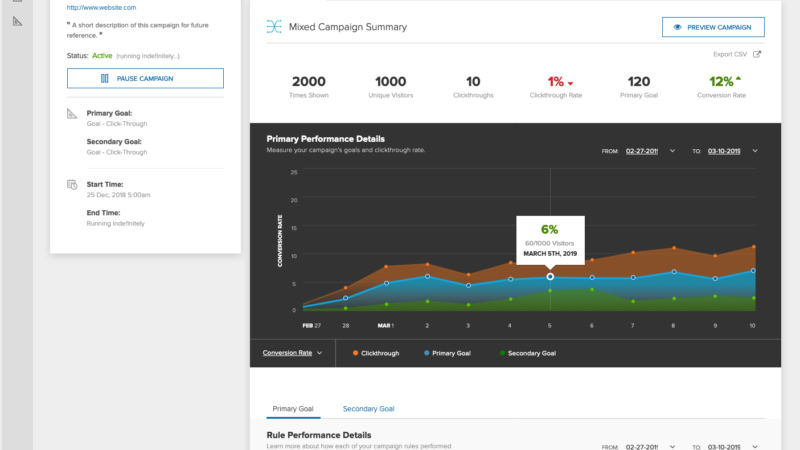
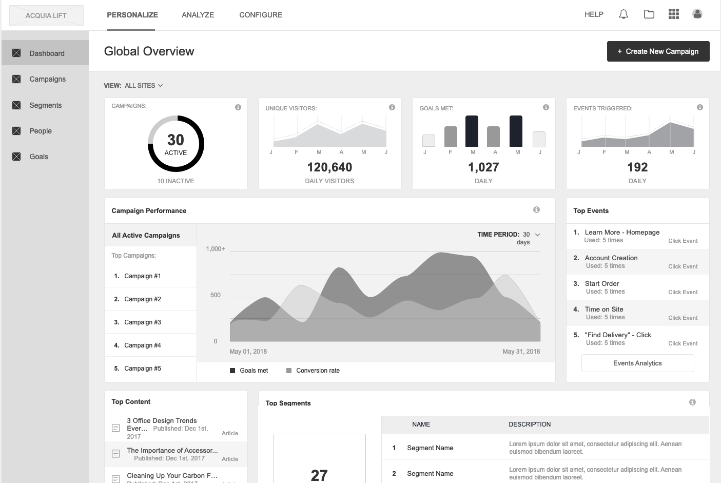
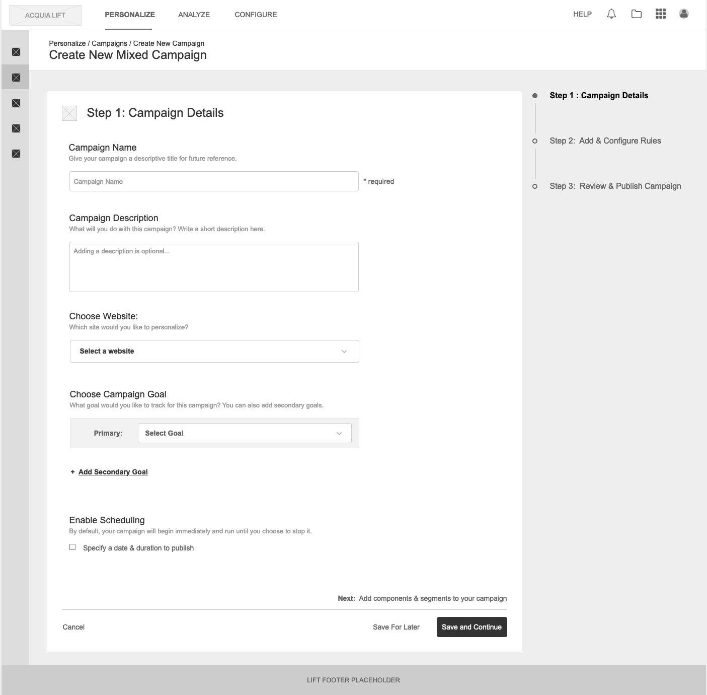
LIFT 3.0 Screens:


Findings:
While no competing product had nailed personalization, there were clear pain points in Lift that were frustrating its users. Through the research and customer interviews it became overwhelmingly clear that Lift 3.0 was far too technical and just not designed properly for the marketer persona.
The feedback primarily centered around 4 big issues:
Step 2: Define Success.
The biggest time sink right now is training others to toggle between all these screens.
Participant 8 Initial round of Lift user interviews.
There were a few obvious solutions for some of this stuff. A single simplified UI for non-technical users would go a long way to address much of the negative feedback and was identified early on a priority goal. However, I constantly advocated throughout the project that we shouldn’t get too hung up on just the UI, as there were significant workflow and scalability issues that needed solutions beyond a better interface.
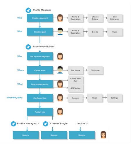
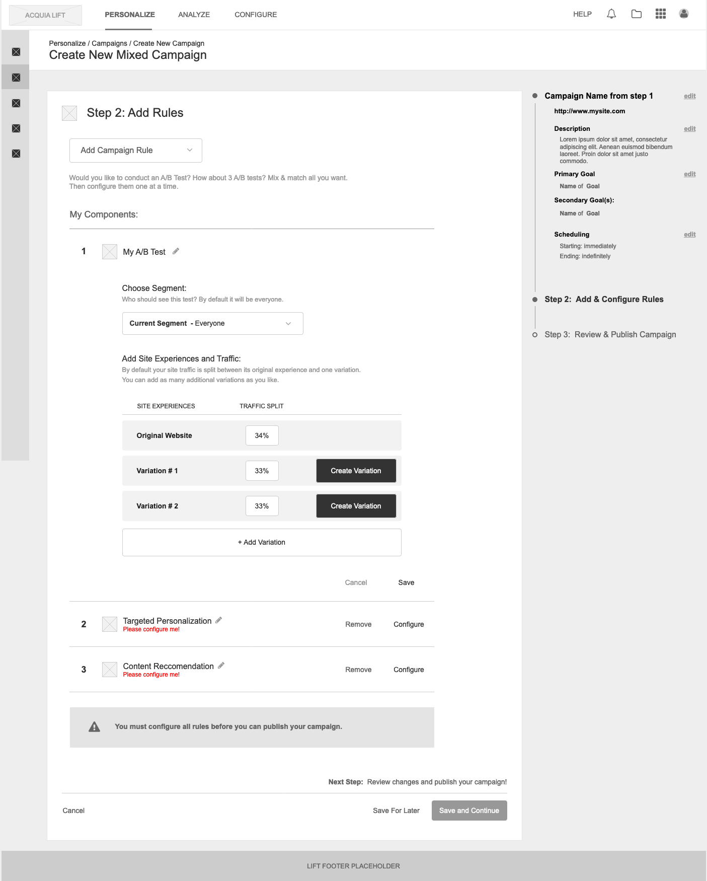
8 steps, 3 UIs, 2 people to make 1 personalization.
I was particularly concerned with the scalability issue. Each personalization in Lift is called a rule. Each rule runs independently and only affects one change on your site. So say you only want to personalize 1 page of your site, but you want to change 3 things on that page? Then that’s three different rules, with three different schedules, three different sets of analytics, and three times that you must repeat an 8 step process. Now imagine that in a large company with a globally distributed marketing dept. and things can quickly get insane.
I immediately prioritized this issue as well as other key workflows like segmenting your audience, creating goals for your personalizations, and generating reports. All of which required UX to focus on the end to end process and users actions, not just the interface.
In the end, my goals for UX to address user feedback were to:
Step 3: Ideate.
While we were conducting the initial round of interviews I started sketching out high-level ideas to address the more glaring issues. The sketches helped to get the ball rolling while brainstorming with Lift’s Product Manager and thoughout the project were great for validation and testing.
For about 3-4 weeks I locked myself and Lift’s Product Manager into a room to work out my ideas for the redesign. At the heart of product design is a good working relationship between product strategy, engineering, and design. So I really enjoyed this fruitful time brainstorming together.

In the white room, with a white board…
I immediately focused on the scalability issue. Not for its own sake, but because at its heart the scalability problem was an organization problem. On a technical level Lift could handle 1000’s of personalizations just fine, the issue was that the product offered no way for a user to organize and make sense of them. Addressing the organization problem would naturally create a structure through which all other issues could be solved.
It sounds kinda abstract, but it was a path to a cohesive solution instead a bunch of independent quick-fixes. So I proposed a higher-level feature called campaigns and reorganized the product’s IA around it. Internally the team also needed a more user-focused framework through which to view Lift, and the concept of campaigns really helped get discussions between product and engineering back on track.

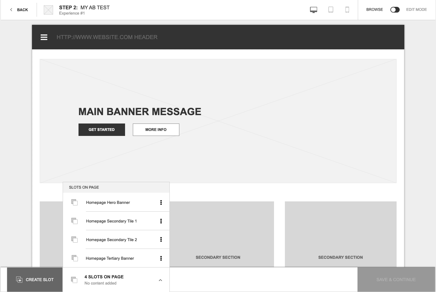
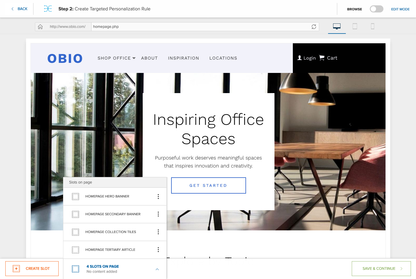
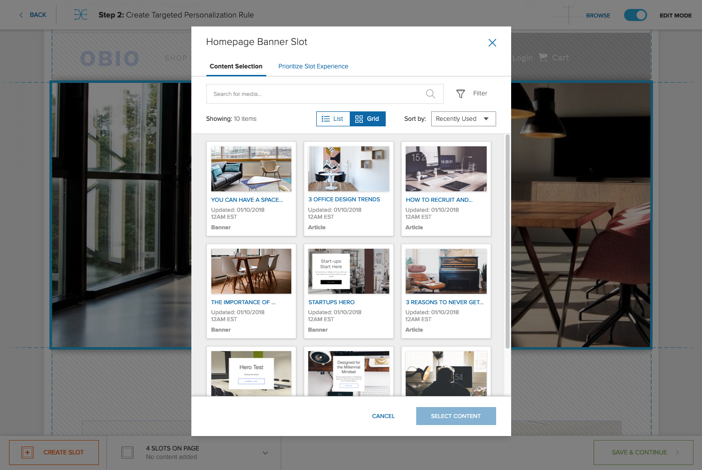
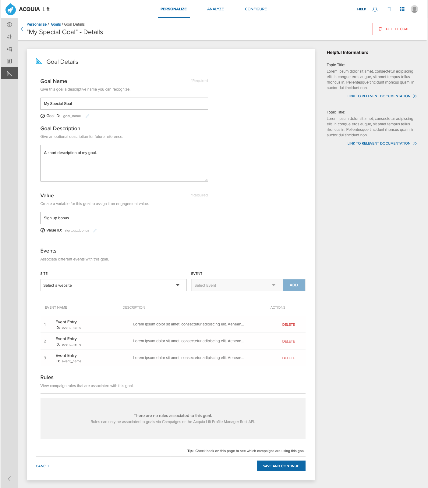
Working through the Experience Builder
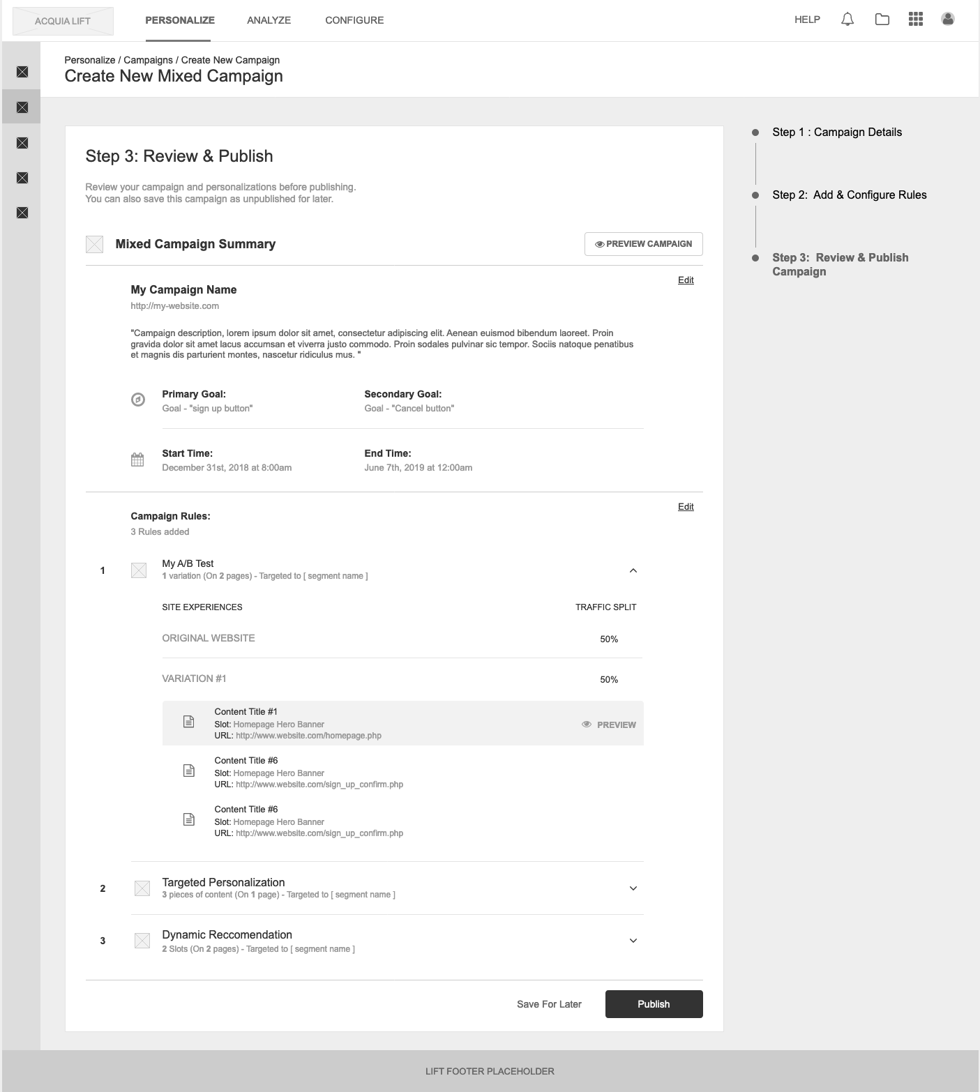
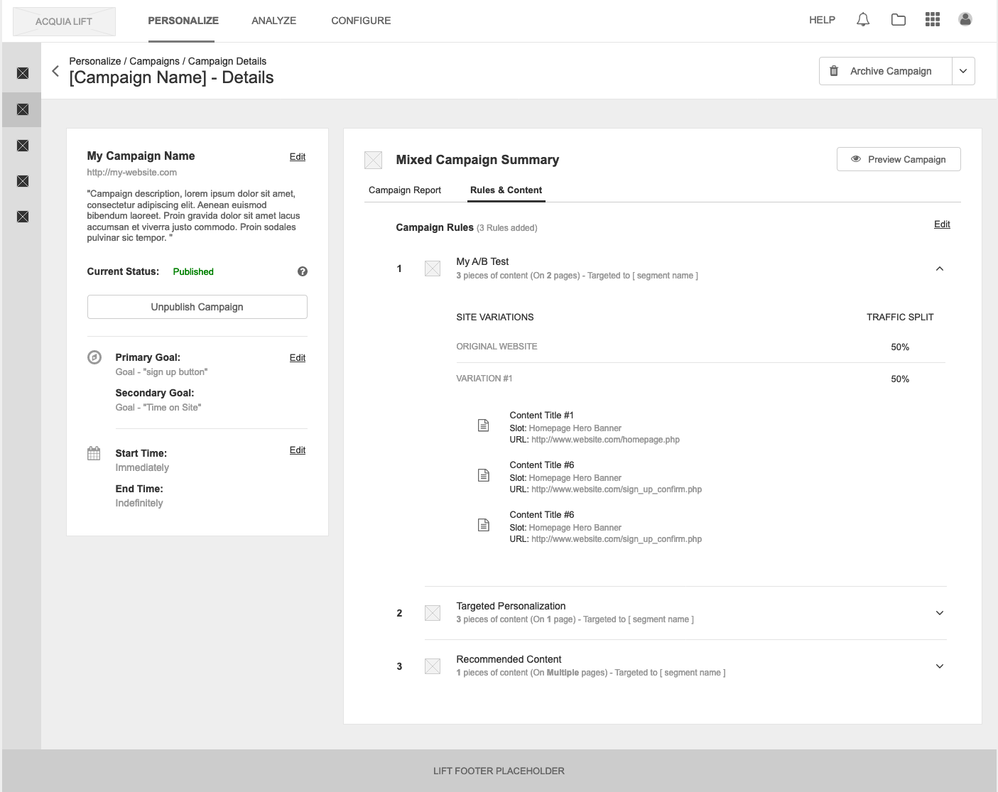
Simply put, Campaigns are the way by which a user can orchestrate multiple personalizations for a single purpose. The term “campaign” while obviously familiar to marketers was up until now, conspicuously absent from the product. You could call it a project, a folder or even a bucket but the word campaign resonated with our users and was described as fitting very naturally with their other marketing work.
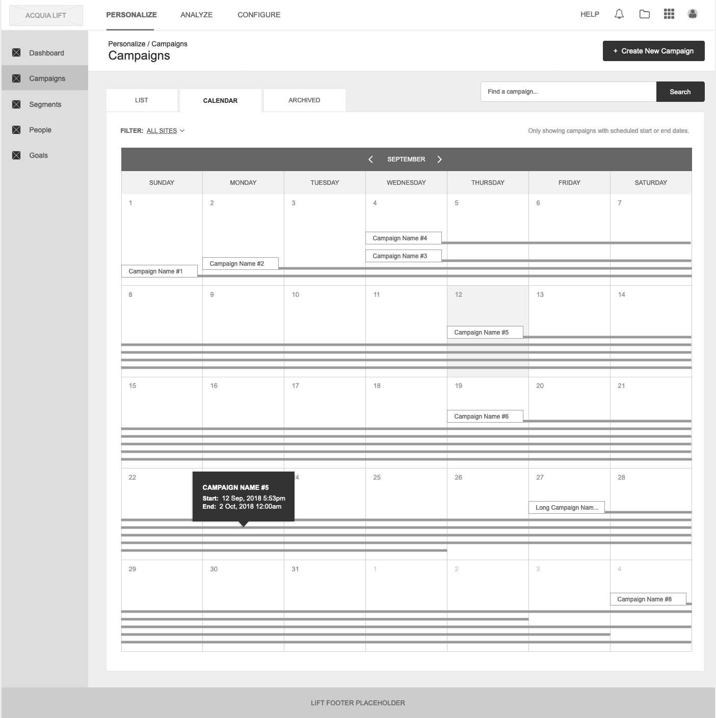
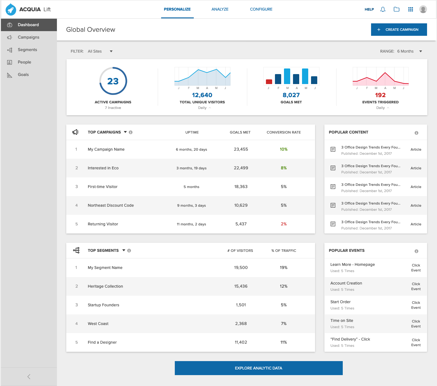
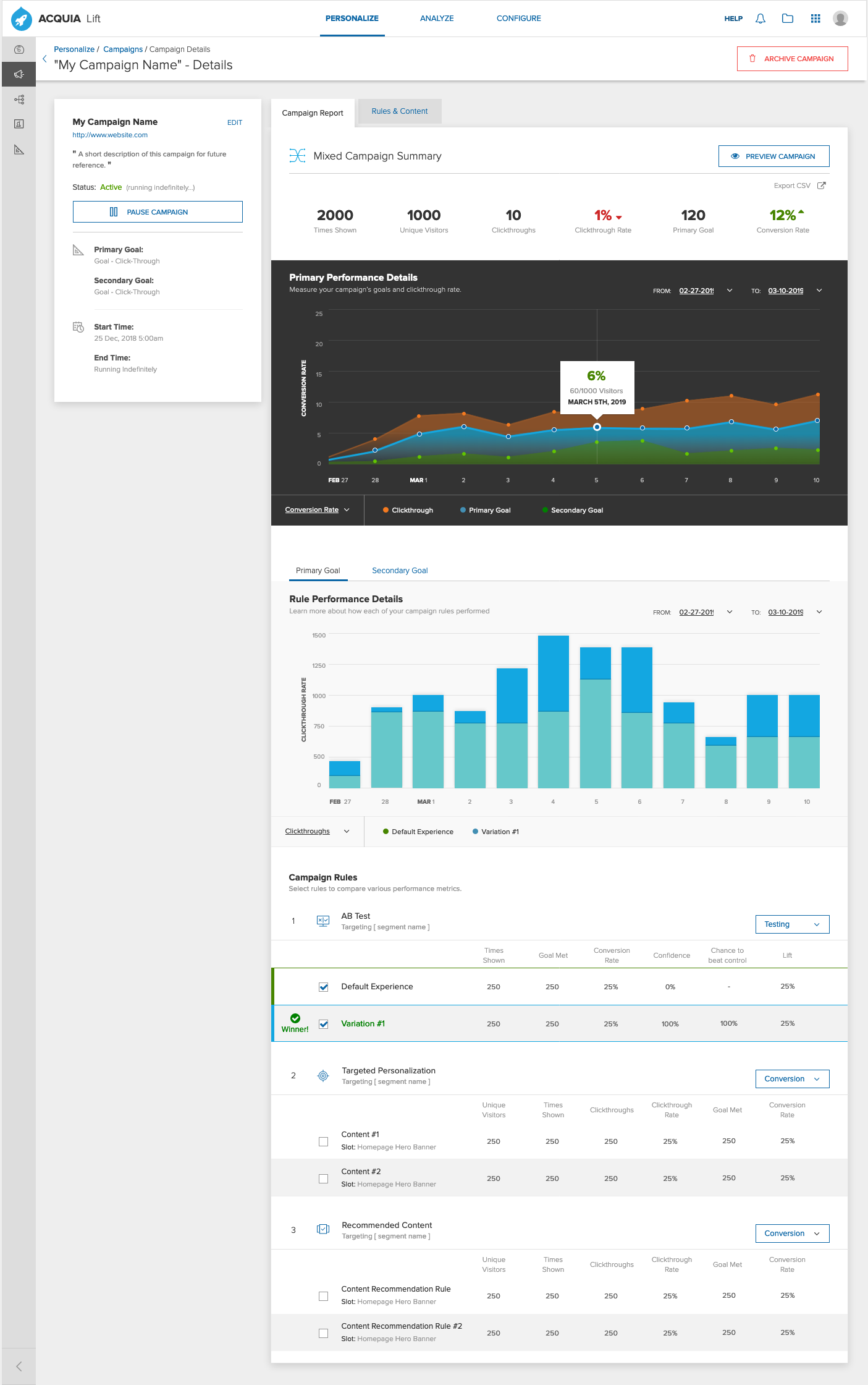
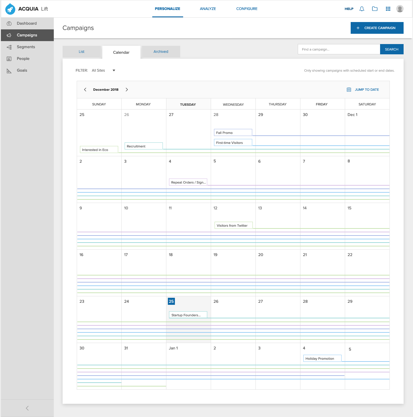
Instead of the multiple rules needed to personalize one webpage, you can create a single campaign to personalize multiple pages. Now you can make personalizations for entire flows across your site. Campaigns can be scheduled to begin or end at specific times and dates. Campaigns aggregate the analytics of multiple personalizations for easier reporting. Campaigns can be duplicated or even templatized for use across a team or whole department. Through the lens of campaigns in Lift we were also able to redesign concepts like goals and events into something more relatable for users.
I sketched out simple campaign creation flows that covered Lift’s existing capabilities while still reducing the total steps to create a personalization from 8 down to 3. During this time I coordinated with engineering to make sure the new APIs were structured to allow the proposed capabilities. I sketched out integrations of Lift’s existing features into the campaign structure while also redesigning them to be far less complicated.

A good example of this was segmentation. Previously in Lift, segmentation had to be done before you made a personalization and was a complicated process with confusing UIs. I proposed a natural language/madlibs-style approach that’s not only easier for marketers, but was simple enough to be done on the fly during campaign creation.
Throughout this phase we touched on almost every aspect of the product and created a plan to start designing, testing, and building it all out. I was constantly sketching out ideas which helped us quickly run internal paper tests with stakeholders to socialize and validate the direction we were going in. After enough internal validation for each aspect of the redesign I would move on to creating low-fidelity wireframes for testing.
Additional LIFT Sketches:


Step 4: Iterate.
With a process in place, we fell into the rhythm of sketching, whiteboards, validation then prototyping. In 2 week sprints I would work through that rhythm with Lift’s Product Mgr. on a new feature or existing piece of the product. I also created Jira boards and all the necessary tickets to track design efforts while the Product Mgr. worked with the dev teams in Toronto to schedule out their work.
The tracking and project structure I created really paid off when the time came to bring on additional resources. Once I had a rough design validated and enough of the groundwork complete, I hired additional designers to blow out parts of my wireframes into greater detail and explore ancillary aspects of the redesign like v3 to v4 migration flows and in-product announcements. It took time to locate and onboard those resources but once we were up to speed they really helped free me up to continue working on larger features and coordinating with other teams like Documentation to create the necessary training and onboarding materials for v4 users.

Round 2 testing feedback.
I was constantly testing and refining individual parts of the redesign and once validated I would merge them into a combined prototype. So about halfway though the project things really started to come together when I finally got the entire product prototyped in Axure. Something like 90% of all flows were fully simulated. This let us do a few rounds of extremely detailed testing and validation to see how the product worked as a whole and how different flows intersect. Amazingly enough, we had no major negative feedback and with a few tweaks here and there to things like A/B testing, we were all set to get these designs built.
The prototype was also helpful in demonstrating to stakeholders and executives the tangible changes users will see in the redesign and communicated a lot of success in the project outward. It was also at this time I was approached by Sr. leadership in the company to work with product marketing to help announce the new redesign at the company’s big Drupal expo Engage.

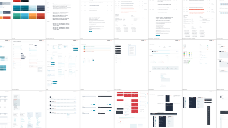
Lift Low-Fidelity Wireframe Examples:
Step 5: Building things, making stuff…
With enough validation, the team moved on to creating high-fidelity designs inline with the Acquia Style Guide. Now the finished product could be fully visualized, with tickets and specs to get developers started. There was a lot of excitement about the redesign, so much so that the deadline for release got moved up! The new version of Lift was to be announced at the next Engage Expo with a live demo of the product. In order to make deadline, certain features like the Global Dashboard and Segmentation had to be moved to the next phase of the roadmap after initial release. 2 more UX designers from other projects were reassigned my team to help out and increase throughput. As the team finalized designs they were added into a new high-fidelity prototype in Axure, using the same interactions as the low-fidelity version. These prototypes were invaluable for generating acceptance criteria on developer tickets and helped smooth the hand-off between design and the dev teams in Toronto.

Diagramming API states for Campaigns
I wrote 12 pages of documentation and a “quick start” guide to familiarize Sales and Documentation with Lift’s new features… which was then used to then write actual, for real documentation. As everyone was busy working through the rest of the designs, I was freed up to partner with product marketing on the Engage demonstration as well as begin work creating a new product for Acquia.
Step by step, page by page, the teams began to make Lift 4.0 a reality. There was a tight cadence of QA meetings, as designers and developers went over every detail of the UI with a fine-tooth-comb. We were making good progress towards our intended release date, however it was going to be difficult having a polished build ready for an advanced demo at Engage. Rather than distract the teams with the burden of the demo, a decision was made that we would use my Axure Prototype instead!
I spent the next 2 weeks working with most of Acquia’s Product Marketing department to script out a demonstration that could be powered by my prototype. I was confident that we could use it to effectively demonstrate the redesign and generate some excitement but I was very clear to everyone, this is like a magic trick. The prototype simulated specific flows, but it did not simulate every single micro-interaction on every element. So we had to make sure we stuck to the script. Wendy’s, one of Lift’s bigger customers and a sponsor of Engage, was so excited about the new redesign they offered to create a special promotion for attendees that we could use in the demo to help tie it all together!

Lift High-Fidelity Wireframe Examples:
Recap
When I first saw the new UX, I was blown away! It’s really slick…
Wendy’s Head of Digital
Lift V4 demonstration video for Acquia Engage:
Check out the videos at the top and bottom of the page. The Engage premiere was a big success! Pre-sales for Lift saw a notable jump in the months following and with the release of Lift 4.0, the following quarter churn went way down and stickiness was already up by 13%. In the following 2 quarters of Lift sales, the only churn the product saw were from customers on Lift V3 who didn’t renew hosting agreements. The team’s feedback was nothing but positive and full of praise as we set ourselves up to continuously deliver improvements to the product over the next year and beyond.
Client responses from Acquia Engage:
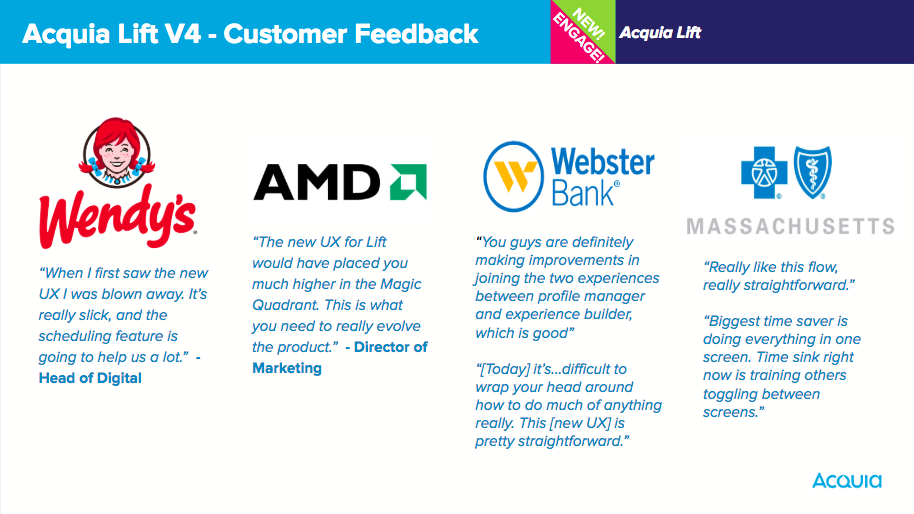
I’d call this pretty decent feedback…